If your theme doesn’t come with support for a responsive, mobile friendly navigation menu, don’t worry. With the WP Mobile Menu plugin, it’s actually really simple to add mobile friendly menu support to your WordPress site. The plugin adds a simple but smooth vertical mobile navigation menu that will slide out from the side of your page on mobile devices. Once you’ve installed and activated the plugin, you don’t have to do much more to get the menu up and running. All you really need to do is to configure the plugin so that the settings meet the individual needs of your site.
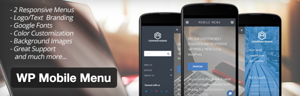
The plugin allows you to customize just about everything relating to the mobile menu. You can choose if you want it to appear on the left or the right side of your site (or even both, should you be so inclined). You choose the viewport size at which you want the menu to appear, and if you’d like to hide any other elements (like your main navigation menu) upon it appearing. You can give it a title. You can customize fonts, font-sizes, font colors, background colors, hover effects…basically anything aesthetic having to do with the menu has a customization option. If for some reason you don’t see an option for customizing the element you’re looking to change, you can also add your own custom CSS right from the dashboard. The plugin also comes with some seriously smooth CSS transitions that are applied when the menu slides out from the side of the page. If you want to make a great experience for your users by providing them with a gorgeous mobile friendly navigation menu, this plugin is the way to go. Not only is it free, but it’s super customizable, light weight, and makes for an overall smooth mobile UX with little to no effort on your part — sounds like a no-brainer.